Process
TYPE
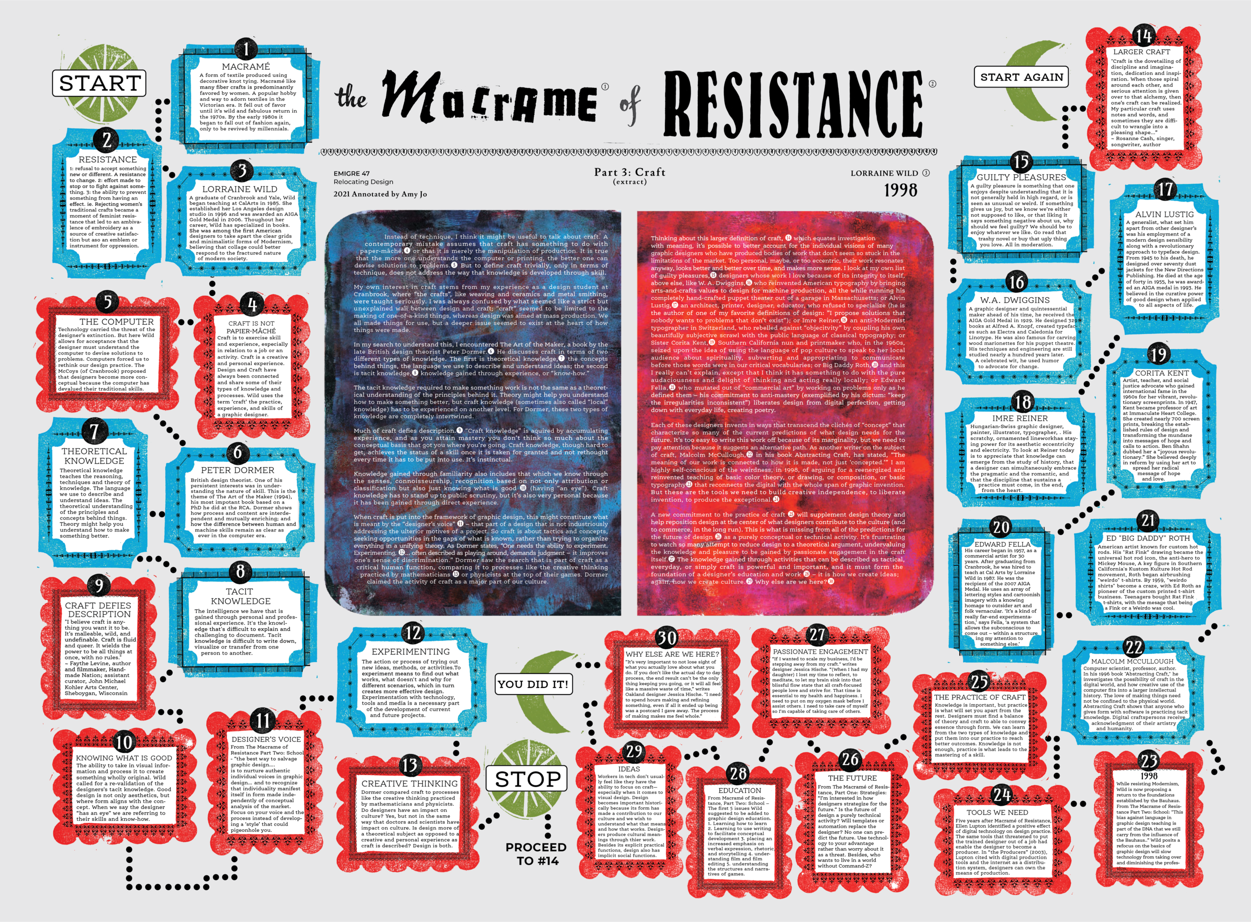
Headline: type collage evoking visual relation of ‘macramé' (smooth, knotting together) versus resistance (chaotic, breaking apart). Visualizing words that are soft and hard in the opposite expression, echoing the way macrame and resistance relate to each other on an underlying level. A unique balance of both craft (design pratice) and knowledge (design theory) are important in how we approach graphic design.
FONTS
I chose fonts created by women to reinforce the importance of bringing women to the forefront and highlighting women in the history of graphic design.
Body / Annotations: Ernestine Pro by Nina Stössinger - Ernestine attempts to combine no-bullshit clarity and seriousness with a friendly attitude.
Sub-title, Author: Lusitana by Ana Paula Megda - Lusitana was inspired by the type found in the 1572 first edition of "The Lusiads,” a Portuguese epic poem by Luís Vaz de Camões.
Byline: Montserrat by Juleta Ulanovsky - Montserrat is a sans-serif font inspired by the old posters and signs in the traditional Montserrat neighborhood of Buenos Aires.
Numbers: Amarante by Karolina Lach - Amarante has bold, highly stylized forms lending it an air of eccentricity and sophistication.
BACKGROUND
Two hand printed, colorful and abstract Gelli prints, scanned and placed in the shape of an open book. The text is the central form around which everything happens on the poster / board.
ANNOTATIONS
Two hand carved block stamps with signature colors for both types of annotations:
1. Critical annotations - Red cloud shape border for critical annotations.
An organic, flexible shape meaning you can change your mind or be wrong. A critical point delivered with a softness (like macramé).
2. Informative annotations - Blue rectangular shape for informative annotations.
A straightforward shape that helps to expand the text and is not up for debate (like resistance).
OTHER
Hand carved block stamps for connecting annotations and directing flow.

